Are you looking to create a bar graph in Google Sheets? Look no further! This article will guide you through the process step by step.
First, you’ll learn how to choose the data for your graph and format it correctly.
Then, we’ll show you how to create the bar graph using Google Sheets’ user-friendly interface.
Finally, we’ll explore customization options to make your graph visually appealing.
So let’s get started and make your data come to life!
Choosing the Data for Your Bar Graph
When choosing the data for your bar graph, it’s important to consider the specific information you want to display. Think about what message you want your graph to convey. Are you trying to compare different categories or show a trend over time?
Once you have a clear objective in mind, gather the relevant data that supports it. Look for data points that are measurable and can be easily represented in a bar graph format. Remember to keep your data organized and labeled properly. This will make it easier for your audience to understand the information you are presenting.
Formatting Your Data in Google Sheets
To format your data in Google Sheets, you’ll need to adjust the settings for your information. Start by selecting the data range you want to format.
Then, go to the ‘Format’ menu and choose ‘Number’ to adjust how your data is displayed. You can choose from options like currency, percentage, or decimal places.
If you want to make your data easier to read, you can also apply conditional formatting. This allows you to highlight certain cells based on their values.
Additionally, you can apply different font styles, colors, and cell borders to make your data visually appealing.
Remember to save your changes regularly to ensure that your formatting is preserved.
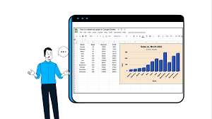
Creating a Bar Graph in Google Sheets
You can easily create a bar graph in Google Sheets by selecting the data you want to include and using the chart creation tool.
First, highlight the data range that you want to use for your bar graph. This can be a single column or multiple columns.
Next, click on the ‘Insert’ menu at the top of the screen and select ‘Chart.’ A sidebar will appear on the right side of the screen with different chart options.
Choose the ‘Bar’ chart option and customize it according to your preferences. You can change the colors, labels, and axis titles to make the graph visually appealing.
Once you are satisfied with the settings, click ‘Insert’ to add the bar graph to your Google Sheets document.
Customizing Your Bar Graph Appearance
Customizing the appearance of your bar graph allows you to personalize it to your liking. In Google Sheets, you have a variety of options to modify the look and feel of your bar graph.
Start by selecting the chart and clicking on the ‘Customize’ tab in the Chart Editor. From there, you can change the colors of the bars, labels, and background to match your preferences or brand. You can also adjust the size and style of the fonts to make your graph more visually appealing.
Additionally, Google Sheets allows you to add a title and axis labels to provide context and enhance the clarity of your graph. By customizing the appearance, you can create a bar graph that is not only informative but also reflects your unique style.
Sharing and Exporting Your Bar Graph in Google Sheets
When sharing your bar graph in Google Sheets, it’s important to consider the privacy settings to ensure that only the intended audience has access to the graph.
To do this, start by opening your Google Sheets document containing the bar graph.
Next, click on the ‘Share’ button located in the top right corner of the screen. A window will pop up, giving you the option to set the visibility of the graph.
By default, the graph will be set to ‘Private’ if you haven’t changed the settings before. However, if you want to share the graph with specific individuals or groups, you can enter their email addresses or Google account names in the ‘People’ field.
Additionally, you can choose to allow them to view, comment, or edit the graph.
Once you’ve made your selections, click on the ‘Send’ button to share the bar graph with the chosen audience.
Conclusion
So, now you know how to make a bar graph in Google Sheets!
By choosing the right data, formatting it properly, and creating the graph, you can effectively present your information.
Don’t forget to customize the appearance of your graph to make it visually appealing.
And if you need to share or export your graph, Google Sheets makes it easy.
With these steps, you’ll be able to create professional-looking bar graphs in no time!